
In today’s fast-paced digital world, businesses are constantly looking for ways to do more with less. Marketing automation has emerged as a powerful solution streamlining tasks, improving personalization, and enabling scalable growth without overloading your team. At Whissel Strategies, we help Toronto businesses harness the power of marketing automation to drive results and stay competitive.
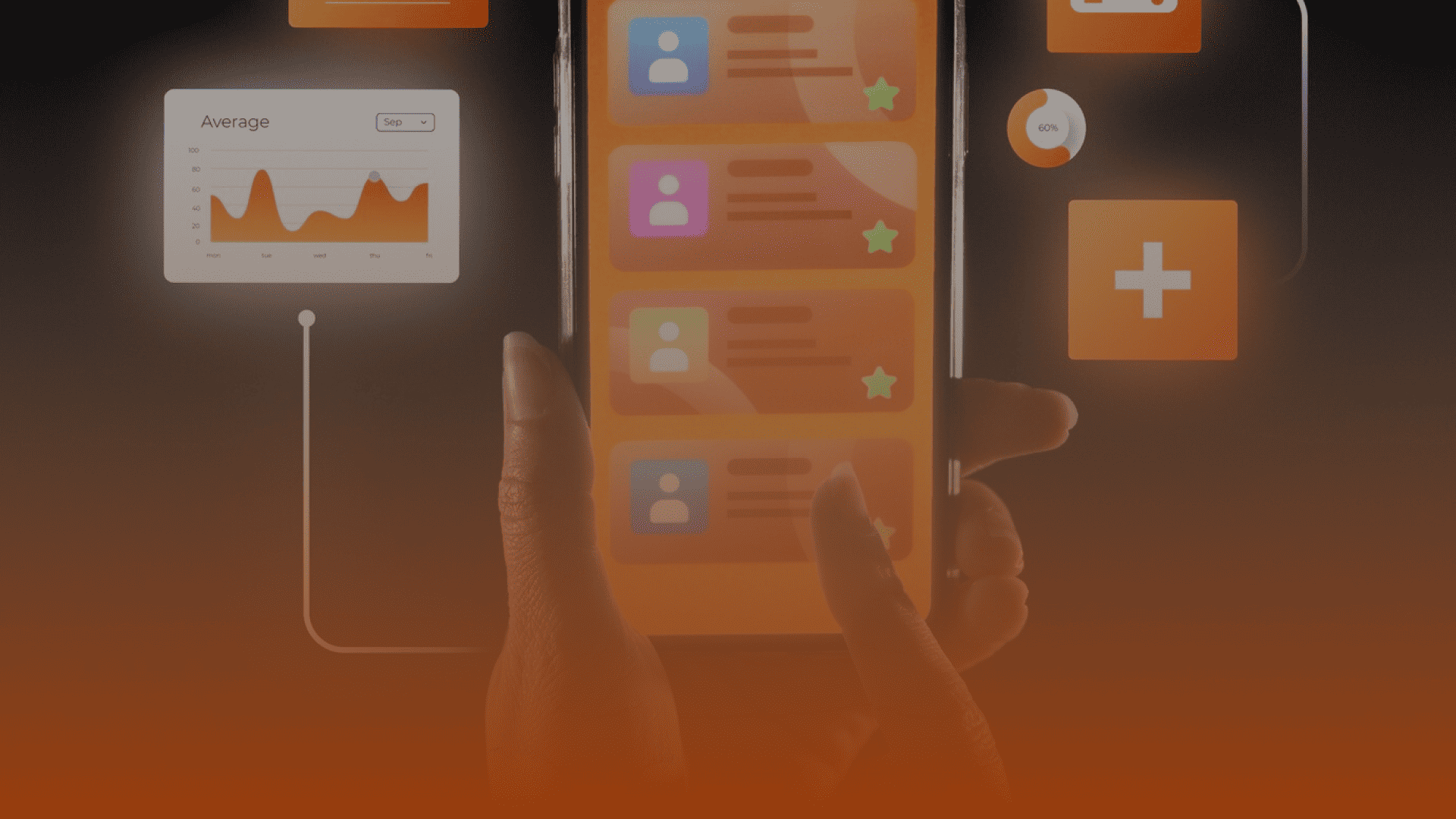
Mobile optimization is the process of designing and formatting your website so it functions smoothly on mobile devices. This includes responsive design, fast load times, intuitive navigation, and touch-friendly interfaces all of which contribute to a better user experience and, ultimately, better business performance.
A mobile-optimized website allows users to easily navigate, browse, and interact without pinching or zooming. This frictionless experience encourages longer visits, repeat interactions, and higher conversion rates.
Google uses mobile-first indexing, meaning it primarily evaluates the mobile version of your site when ranking search results. If your site isn’t mobile-friendly, it may rank lower impacting your visibility and organic traffic.
With more users browsing on mobile than desktop, optimizing for mobile ensures you capture and retain this large segment of potential customers.
Users are more likely to complete purchases, sign up, or contact your business when the mobile experience is fast, intuitive, and hassle-free.
Brands that deliver a smooth mobile experience stand out. Mobile optimization builds credibility, trust, and loyalty positioning you ahead of competitors who neglect it.
Responsive design ensures your website automatically adjusts to fit different screen sizes. This eliminates the need for separate mobile and desktop versions and delivers a consistent, optimized experience across devices.
Mobile users expect fast load times. To enhance performance:
Improve visibility in mobile search results by:
Make it easy for users to find what they need:
Optimize forms for ease of use:
Mobile users scan content quickly. Improve readability by:
If you’re in e-commerce, a frictionless checkout is essential. Offer:
AMP technology enhances speed and usability for mobile users. It strips unnecessary code and loads pages almost instantly improving both UX and SEO.
Regularly test your site on various devices and browsers. Tools like Google’s Mobile-Friendly Test, PageSpeed Insights, and Search Console can help you identify and fix performance issues.
At Whissel Strategies, we offer tailored mobile optimization services that deliver results. Our services include:
We combine technical expertise with strategic thinking to help businesses build mobile experiences that convert.
The digital landscape is mobile-first and growing more so each day. Businesses that prioritize mobile optimization are better positioned to connect with customers, convert more leads, and build lasting relationships. Whether you’re a local startup or an established brand, mobile optimization is the key to staying relevant and competitive.

Book a 30 minute growth call, where Bailey Whissel will personally assess your business, identify challenges and goals, and create a customized one-page growth plan.